Verizon
Redesigning Perk Tiles for Scalability and Clarity
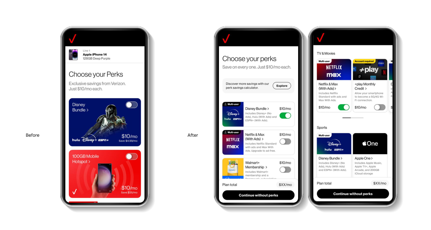
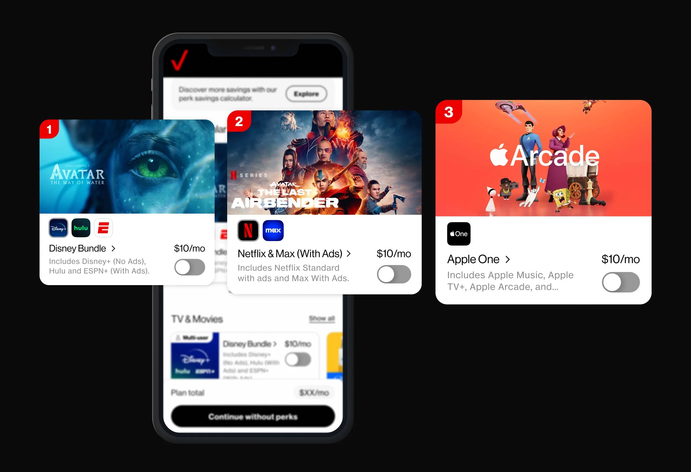
Verizon’s plan acquisition experience relies heavily on perk tiles to communicate value, savings, and differentiation.
However, the existing design struggled with scalability, hierarchy, and consistency, making it difficult for users to fully understand and activate available perks.
Role
Senior Experience Designer - Publicis Sapient
UX/UI Design · Product Thinking · Visual Design
Challenge
Users often skipped or misunderstood perks during plan selection, impacting activation rates and perceived plan value. The product needed a solution that could scale across plans, support future perks, and remain aligned with Verizon’s design system.
Approach
Audited existing tiles to identify usability and hierarchy issues
Conducted competitor benchmarking across global telecom products
Designed a modular system focused on clarity and reuse
Prioritized scalability over one-off visual solutions
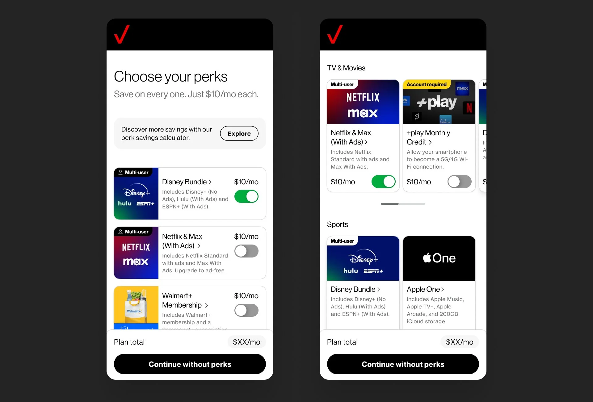
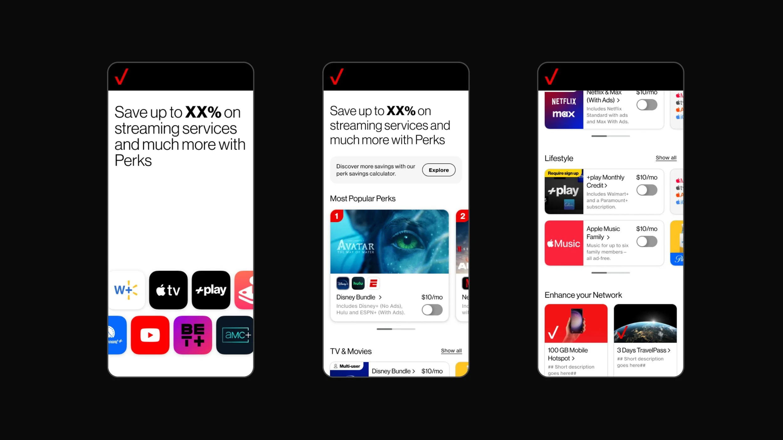
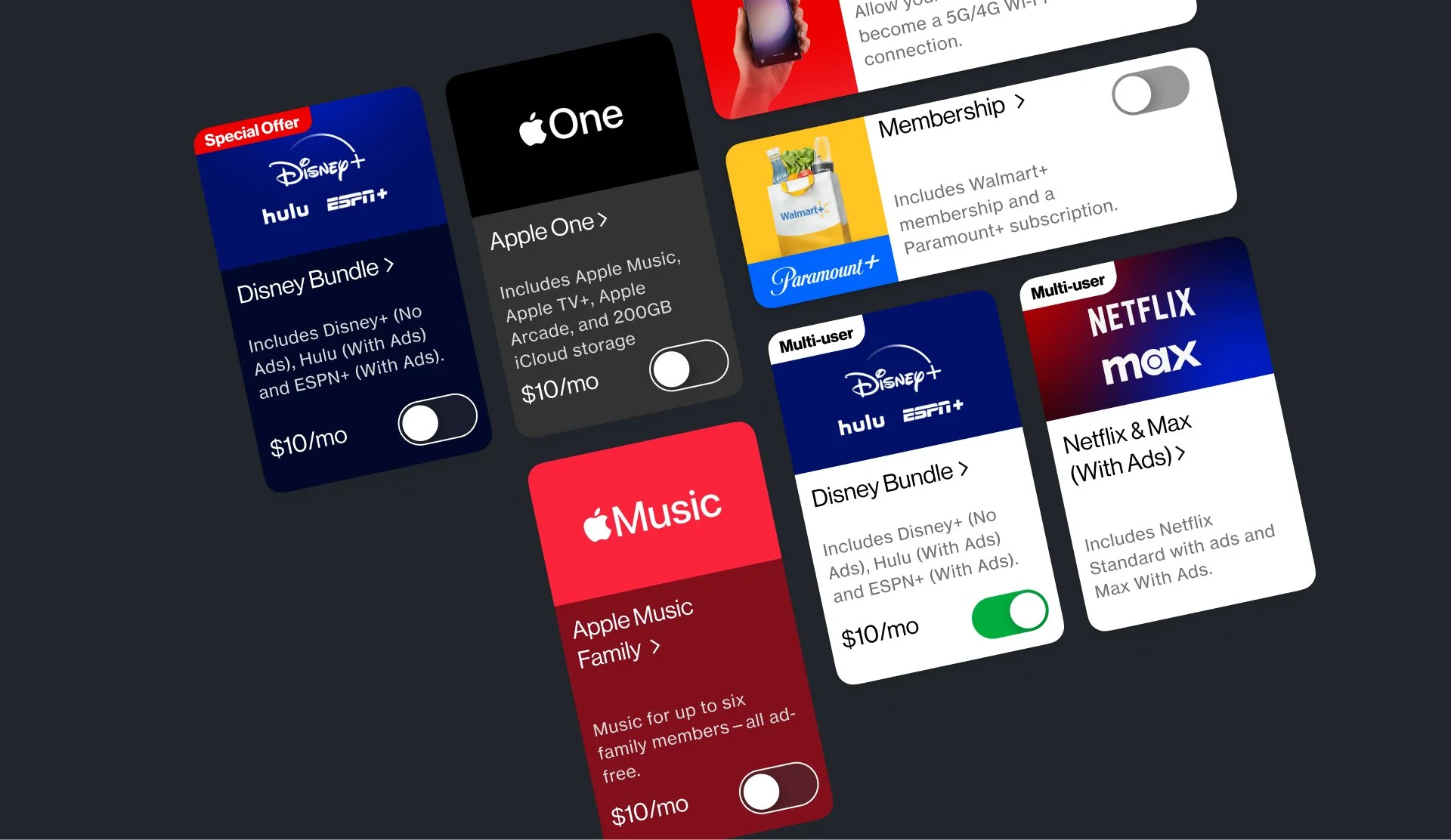
The Solution
A redesigned perk tile system with improved hierarchy, clearer CTAs, and consistent visual structure. The new design allows users to quickly understand perk value and activate them with confidence.
Impact
Improved clarity during plan selection
Better scalability for future perks
Stronger alignment between product, system, and business goals
Future Vision
In parallel with the delivered solution, we explored a future vision for the perks experience—introducing subtle motion, clearer prioritization of high-value perks, and improved hierarchy to better support activation decisions and strengthen perk attachment.